© IE Online Media Services Pvt Ltd
Journalism of Courage

 Many said they are getting confused with all the logos looking similar for various Google apps.
 Tech giant Google recently update the logos for many of their services, but many Indians have decided to question the change of the logo of their email service Gmail. Some have complained they hate it days after using it, and some have asked that the internet giant restore the old logo.
Gmail new colourful logo emphasises an M that features all the colours in the company’s logo: red, green, yellow and blue. The change in the logo results in its colour scheme matching those of Google and other products like Maps, Photos, Chrome, and other products. The previous logo of Gmail has been around since 2013.
The change comes soon after Google announced that it is working in transforming what is known as the G Suite to ‘Google Workspace’ in order to give users a more centralised experience.
However, some argued against the change in logo saying the previous logo was perfectly fine. Others argued it needed to be changed for the better.
The new Gmail logo is silicon valley’s version of a nose job gone horribly wrong😭
— doobydoobydoo (@dangerrnoodlle) October 30, 2020
We all thought 2020 is shit enough and then there comes the new Gmail logo
— joven (@joven) October 30, 2020
Nope. After a few weeks… I’m still not a fan at all of the new Gmail logo.
— Lowko (@LowkoTV) October 30, 2020
I hate the new Gmail logo. Mail comes in ENVELOPES, Google. pic.twitter.com/8Xmq67uhos
— Darrin Wright (@darrinwright) October 29, 2020
Gmail’s new logo is surprisingly similar to @monzo and that makes for very confusing notifications. It’s an email, no – I bought a coffee earlier, no it’s a calendar event confirmation. 🤔 pic.twitter.com/D4CMH5uj4m
— Alex Ellis (@alexellisuk) October 28, 2020
the new gmail logo bothers me more than it should pic.twitter.com/Iaky3RDMha
— Macro (@TheMacroShow) October 29, 2020
Me @ the new gmail logo pic.twitter.com/B1MrZoIDyi
— That Clara-fright 👻 (@thatclarafied) October 29, 2020
I hate the new gMail logo. It lost the cool envelope look :( pic.twitter.com/nXDvU5VJHB
— ᴛᴜᴍʙᴋᴇ ⏻N:E (@tumbke) October 28, 2020
The new Gmail logo keeps freaking me out. pic.twitter.com/OI8L2oOfUC
— KillingMyCareer (@MelaynaLokosky) October 28, 2020
an accurate representation of my feelings towards the new gmail logo pic.twitter.com/A4mK9GM6f2
— Michael Galley (@michael_galley) October 28, 2020
I feel like the new Gmail logo should have looked more like this, given the overlaps. pic.twitter.com/SAo2TLUgFX
— Evan Blass (@evleaks) October 27, 2020
Nobody:
Gmail: Check out our new raggedy logo!!!
😒😒😒😒😒 pic.twitter.com/dn5pFAqyxF
— Luvvie is the #ProfessionalTroublemaker. PREORDER. (@Luvvie) October 26, 2020
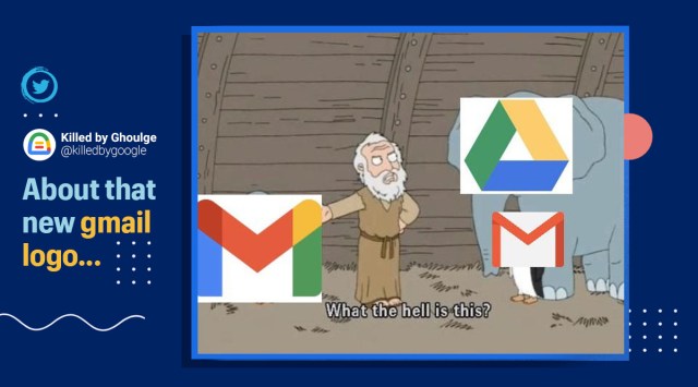
about that new gmail logo… pic.twitter.com/HVswssM84A
— Killed by Ghoulge 👻 (@killedbygoogle) October 26, 2020