What is Pantone, and why does it crown a ‘Colour of the Year’ every December?
Pantone began as a printing business. How — and why — did a company decide to become the authority on colours? We explain
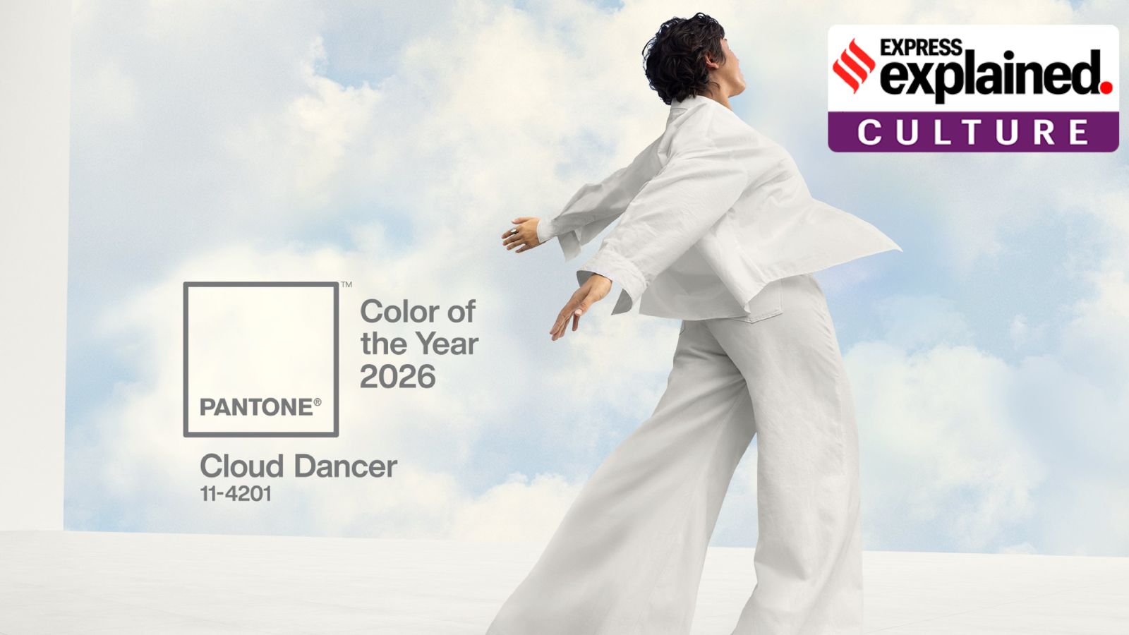
 On Friday, Pantone announced the shade “Cloud Dancer” as the colour for 2026. (X/Pantone)
Come December, companies ranging from the music streaming app Spotify to news organisations aim to devise novel marketing strategies and ‘Best of’ lists to become the next eagerly-awaited cultural milestone.
One such arguably successful attempt comes from Pantone, an American company that began as a printing business and now announces a predictive ‘Colour of the Year’ every December. On Friday (December 5), it announced the shade “Cloud Dancer” as the colour for 2026, describing it as “a lofty white that serves as a symbol of calming influence in a society rediscovering the value of quiet reflection.”
How — and why — did a company decide to become the authority on colours? We explain.
What is Pantone?
The company had its origins as a commercial printing company in the 1950s in New Jersey, owned by the brothers Mervin and Jesse Levine. When Lawrence Herbert — a Hofstra University graduate with impeccable knowledge of chemistry — got on board as a part-time employee, it took the company in a new direction.
Herbert, with his skill as a chemist, simplified and systematised the company’s huge arsenal of pigments and eased the production of coloured inks. In 1962, Herbert bought over the ink and printing division and renamed the company Pantone. His knowledge of colour and pigments and the resultant standardisation made sure that the colours did not change their tints and hues under sunlight and other physical circumstances. That’s how everyone in the world knows what the Coca-Cola red is — originally Pantone 484 — and how Starbucks has its statement pine green — the Pantone 3298.
In 1963, the company introduced the Pantone Matching System (PMS), which is, simply put, a standardised colour reproduction system. It led to the creation of guides, which are essentially thin cardboard sheets approximately 6×2 inches or 15×5 cm and are printed on one side.
The idea behind the PMS, which contained swatches, was to allow designers to ‘colour match’ specific tints and hues, especially when a design entered the production phase. The system over the decades became the norm to be sworn by, as graphic designers, printing houses adopted it wholeheartedly.
The colour chips went on to become synonymous with colours in the fashion world, and also that of interior design, especially after Pantone placed the chip on a series of ads during the New York Fashion Week in the early 2000s, making it the industry standard.
And why does Pantone release a Colour of the Year?
In 2000, Pantone and the Pantone Color Institute started announcing the ‘Colour of the year’. The first-ever ‘colour of the year’ was Cerulean Blue 15-4020.
The colour of the year is chosen after several meetings over the course of a year. Their website says they “comb the world looking for new color influences. This can include the entertainment industry and films in production, traveling art collections and new artists, fashion, all areas of design, aspirational travel destinations, new lifestyles, playstyles or enjoyable escapes as well as socio-economic conditions.”
As a company dealing in colours, there is a clear commercial rationale for Pantone to promote a wide variety of shades and link them to aesthetic trends. This year, for instance, Pantone has collaborated with brands such as Motorola and Play-Doh (among others) to release products such as phone covers in the Cloud Dancer shade.
Its website says, “The goal of the program is to help companies and consumers better understand the power color can have. We want to teach them how to leverage color’s power and expressiveness to influence perception — whether it be to create a more successful design strategy that will increase consumer engagement, or to use it to better showcase your own personal identity.”
But beyond its own commercial interests, the reason the announcement attracts global attention perhaps has to do with some intrinsic property of colours, and how, for many people, they can hold at least some kind of meaning. As Pantone puts it, “On any given day, the colors you choose to wear are affected by your mood and your desire for how you want others to perceive you. Color is an important part of the message you send to the world.”
At times, these picks can also impact several industries for years to come.
A 2020 Business Insider report said, “Pantone-chosen colors inevitably end up in homes as accent walls, in films and TV shows, and in a range of consumer products: cookware, luggage, furniture, shoes, handbags, and, of course, clothing. Part of that proliferation is due to a number of agreements Pantone strikes each year with major companies… As soon as the Color of the Year is announced, consumers are served matching jewelry, luggage, and even skateboards in Pantone’s chosen color.”
But why is ‘Cloud Dancer’ proving divisive?
While a section of people found it classic and minimalistic, others criticised it as lacking in inspiration and energy. In the US, some even made connections to the political belief of White supremacy, in the year of Donald Trump.
Though Pantone’s choices often lead to discussions about whether the colours are worthy of the title, the Cloud Dancer’s white-ish shade has seemingly provided something of a literal blank canvas for people to project their appreciation, or lack of it.
- 01
- 02
- 03
- 04
- 05


