© IE Online Media Services Pvt Ltd

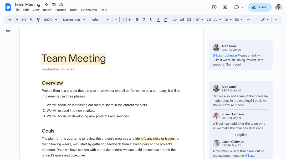 The new Google Docs borrows a lot from Gmail's upgraded look (Image: Google)
 First introduced with Android 12, Google’s Material You design language brought perhaps the biggest update to the operating system in terms of the UI in years. Both system and apps now switch colours based on the currently set wallpaper. But Android isn’t the only Google product soaking up the goodness of Material You. Last month, a report revealed that Google is working on a similar Material You makeover for multiple of its Workspace apps. The company has now announced it’s rolling that out.
Google Docs, Sheets, and Slides on the web will now adhere to the Google Material Design 3 guidelines, bringing along a refreshed user interface. The single screenshot shared by Google shows Docs with a splash of light blue across its interface. The company says that the UI has been “simplified” to help you “find frequently used actions faster.”
While there are no changes in functionality, some features have been relocated to “reduce clutter within the new interface.” The latest status info for the document, such as the last edit and version history can be accessed from the clock icon on the top right.
Google Drive has been updated as well with some easily available filters that help you search for a certain file type quicker. You can also select multiple items at a time and undertake batch operations for frequent tasks. The application had already received a Material You makeover several months ago, so this update isn’t as broad as the one being rolled out to the office apps.
The Material You makeover along with the Google Drive update is seeing a gradual rollout that commenced on March 6.