© IE Online Media Services Pvt Ltd

 Opera now serves over a billion internet users every month.
Internet major Opera Software has gone for a brand refresh with a new look and feel.
“It’s time for a consistent brand identity that reflects what Opera is about: We want to enable more people, in more places, to experience what matters, when it matters most,” said a release from the company.
Video: Opera brand
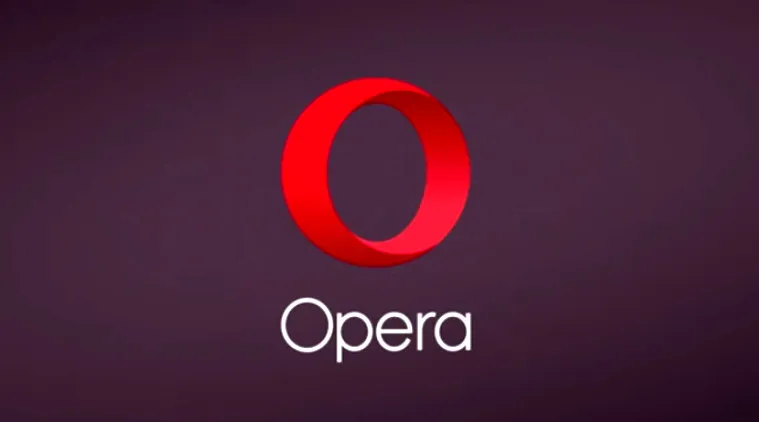
Opera’s new brand identity revolves around the redesigned logo which preserves the familiar red “O” but envisions it as a “portal quickly connecting you with what you’re looking for on the web”. “The 3-dimensional “O” symbolizes a gateway that leads you to more: more content, more discoveries, more answers, more communication, more fun, more data savings, more of life – whatever you seek online, Opera helps you do more!”
The company said with the extended Opera family and its ever-expanding range of products and services, the company has grown beyond the bounds of a software company. “Today, we see Opera more as an internet company providing great experiences online. To reflect this, we have dropped the “Software” from our logo,” said the note.
Opera, now serves over a billion internet users every month, between the 350 million people around the world experiencing the internet through our apps and services and the 800 million people we reach through Opera Mediaworks, the release added.
The new brand identity has involved a tight collaboration between Opera’s in-house creative team and two independent agencies, UK-based DixonBaxi, who defined the global brand and creative strategy, and Anti from Norway, which worked on the visual identity.