© IE Online Media Services Pvt Ltd

 Google Chat is a communication and collaboration tool for teams. (Express photo)
 Google Chat is getting a makeover. The company announced a new redesign for its messaging app that aims to make it more user-friendly and productive.
The redesign is based on Google’s Material Design 3 system, which features rounded buttons, blue accents, and a light blue background. When it rolls out, Chat’s interface will match the redesigned interfaces of Google’s other apps such as Gmail, Drive, and Docs.
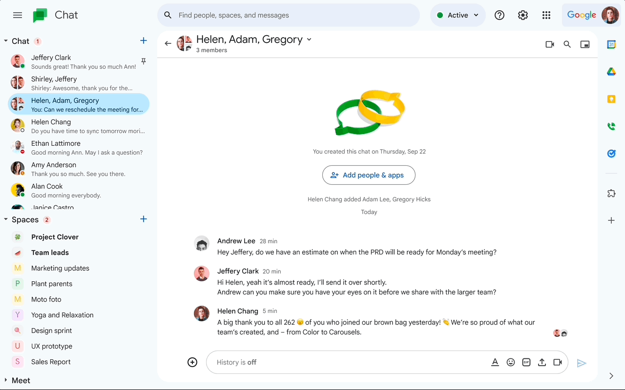 Google Chat’s new interfaces now matches with other Workspace apps (Image: Google)
The new design also brings some changes to the layout and functionality of Google Chat. For example, users can now create announcement-only channels for spaces, which are similar to Slack’s channels. This can help teams communicate important updates without getting lost in other conversations.
The new look for Google Chat is rolling out gradually over the next few weeks to all Google Workspace customers, as well as legacy G Suite Basic and Business customers and users with personal Google Accounts. Google hopes that the redesign will make Chat more consistent and intuitive across its apps.
Google Chat is a communication and collaboration tool for teams. It replaced Google Hangouts and integrates with Workspace apps like Docs, Meet, and Spaces. Users can chat with anyone, create group conversations, use bots, and search across Chat and Gmail. It is available on web and mobile for free for anyone with a Google account, and for paid Workspace users.