© IE Online Media Services Pvt Ltd

 Taylor Swift said orange 'feels like kind of energetically how my life has felt'. (Photo: store.taylorswift.com)
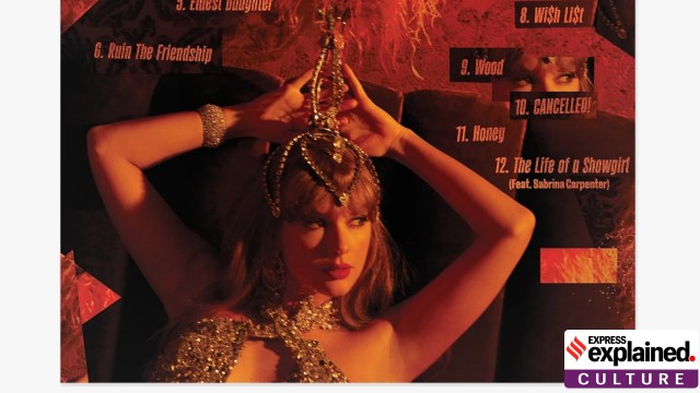
Taylor Swift Album Color Orange Explained: Taylor Swift’s new album, The Life of a Showgirl, will be out on October 3, the singer announced last week. The album’s vinyl records can be pre-ordered on her website, in the colour ‘Portofino Orange Glitter’. As with anything related to Swift, brands have swiftly jumped on to the colour, with Netflix, FedEx, Walmart, M&Ms, Playdoh, Sesame Street, United Airlines, Cinnabon, and others featuring orange in their posts and campaigns.
On Google, searches for “Taylor Swift” returned orange digital confetti and an orange heart.
new profile pic 🧡 pic.twitter.com/vn8J6730dw
— X (@X) August 12, 2025
But what exactly is Portofino Orange, and what does it denote? We explain
Swift has been wearing orange outfits in the last leg of her record-breaking two-year-long Eras Tour. On August 13, when she appeared on the podcast New Heights, hosted by her boyfriend Travis Kelce and his brother Jason Kelce, she spoke about the colour.
“I’ve just always liked it, Jason,” she said, as quoted by AP. “It feels like kind of energetically how my life has felt. And this album is about what was going on behind the scenes in my inner life during this tour.”
Orange is indeed bright and vibrant, although that has meant the colour being associated with danger and alarm. Think traffic cones, the India Meteorological Association’s orange alerts, and the orange uniform of American prisoners, familiar to most of us thanks to TV shows. After the Air India flight crash in June, many of us learnt that aeroplanes’ black boxes are actually orange so they can easily be spotted among the wreckage or in water after a crash.
Portofino is a fishing village in Italy, known for its charming coastline and a preferred vacation destination for the rich and famous. Portofino is known for its pastel-coloured houses, which often have architectural details like colonnades, ornamental windows, etc. painted on the facade, rather than actually constructed. This makes the houses stand out against the blue of the water, and look specially ethereal in the orange rays of the setting or rising sun.
Traditionally, there were practical reasons behind the aesthetic beauty. Fishermen needed their houses to stand out against the sea so they could make out which village they should head to when returning from the ocean. According to the publication Italian Segreta, natural, locally available pigments used in the area gave ochre and terracotta colours, which are shades of orange.
Also, in the narrow lanes of these coastal villages, painting on architectural details was easier than moving in heavy machinery to actually build those features.
A very brief history of orange
While the colour orange has probably been known to humans since the first sunrise, the English word for it is much more recent — as late as the 16th century, according to British historian Kassia St Clair in her book ‘The Secret Lives of Colours’. “…before that English speakers had used the cumbersome portmanteau giolureade or yellow-red,” St Clair writes.
The colour orange was brought into prominence in art by the Impressionist movement, which originated in France in the 1860s. “The painting that gave the movement its name, Claude Monet’s Impression, Sunrise, has, at its centre, a bright orange sun. This new school of artists, fired up on new optical theories of colour contrasts, made extensive use of orange. Paired with blues (its opposite on the colour wheel) the super-bright chrome and cadmium pigments produced zinging contrasts that were deployed again and again by artists including Toulouse-Lautrec, Munch, Gauguin and Van Gogh,” St Clair writes.