Gmail for Android, iOS gets new look with white redesign on mobile apps
Google is rolling out material theme update for its Gmail app on Android and iOS. Android users can update the app from Google Play Store to get the new look whereas iOS users have to wait for some time.
Google’s Material theme is live on Gmail app for Android, iOS will soon follow (Right part has been blurred for privacy reasons)
Google is rolling out a new design for its Gmail app for both Android and iOS users. The new theme was announced by Google last month, and is now available to download for Android on the Google Play Store. The update was also available on iOS for iPhone users.
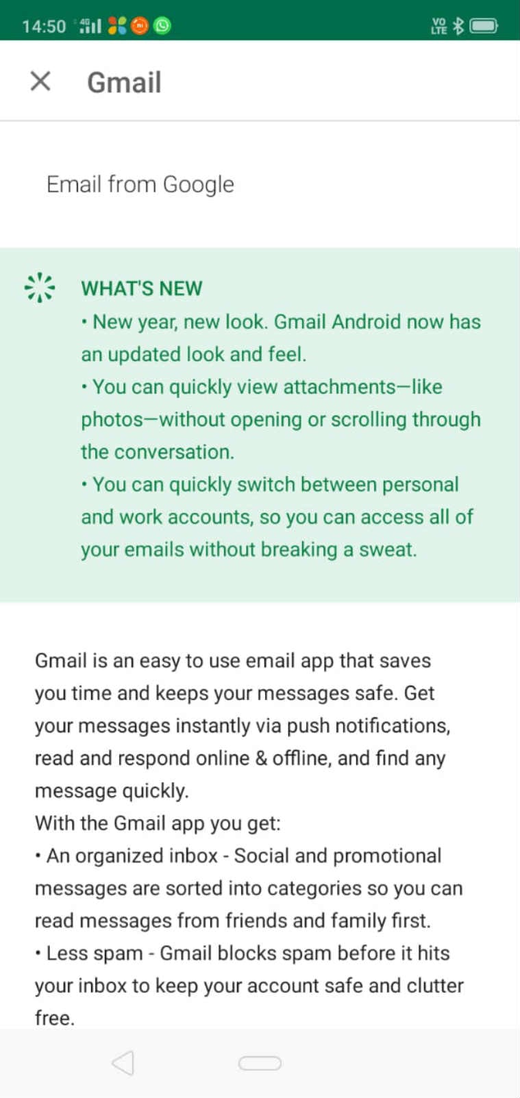
The material design does away with the red menu bar on the top to include a search bar. The app works the same, but the whole interface looks all white. For users, who have more than one Gmail account, they can switch between the accounts by tapping on the user icon placed right next to the top search bar.
You’ve Read Your Free Stories For Now
Sign up and keep reading more stories that matter to you.
Watch: Google rolls out Night Sight for Pixel, Pixel 2 and Pixel 3
There are some additional changes as well. Users can now see and quickly access attachments in the Inbox without opening the mail. The interface is cleaner and allows better visibility of text as ‘it looks less crowded’. The menu options to the left still include the old labels like Starred, Snoozed, Important, Sent, Outbox, Drafts and more.
The changelog for Gmail app on Google Play Store reads, “New year, new look. Gmail Android now has an updated look and feel.”
After Google Keep, Chrome and Photos, Gmail app also gets the new look.
As soon as you update the app and open Gmail, you will be asked to select from Default, Comfortable or Compact email view.
Months after Google rolled out the Material theme for Gmail on the web browser, it has started implementing the new look to its key apps like Google Keep, Chrome and Photos. Gmail app is the newest addition to the list.